

The visual language of AOL 2.5
The visual language of AOL 2.5
on metaphors and interiorization
If you were among the millions of Americans who purchased an ISP subscription and went online for the first time in the very middle of the 1990s, this was probably what you saw after your modem stopped hissing and whistling:
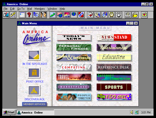
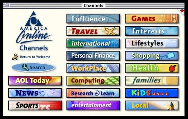
Here we have the main menu of America Online version 2.5, released in 1995. (Later versions would call it the “Channels” window.)
Though AOL is probably most often spoken of with smirking bemusement today, and was maligned as an obnoxious upstart even during its prime, there’s no denying the indispensable role it played in driving the digital revolution. It was the training wheels, water wings, and practice bra for a tremendously wide slice of the public that wanted a user-friendly introduction to this “internet” thing they’d been reading about in the magazines. At a time when the web was decentralized, not necessarily easy to navigate, and perhaps a bit hostile towards normies impinging on nerd turf, America Online was aptly regarded as a virtual gated and planned community: curated, cuddly, and superlatively basic.
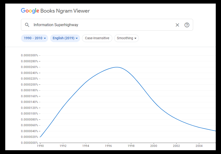
For a time in the 1990s, the buzzphrase “information superhighway” was often used in lieu of “world wide web” or “internet” on magazine covers and in headlines and marketing matter. Aside from being a rather snappy way to refer to an exciting and exotic new technology, it made the idea of the internet more intelligible to the public. Ports, protocols, and packets weren’t (and still aren’t) something the layperson can be expected to have a technical understanding about; circa 1994, desktop computers were seen by many as being too intrinsically arcane for everyday household use, and people who didn’t interact much with them in their everyday lives weren’t going to get excited by a pitch like “this thing lets computers talk to other computers via phone lines!”
But a highway metaphor not only called to mind the automotive revolution that changed American society, built up a cornerstone of the nation’s industrial economy, and offered the public a freedom and speed of movement unknown to any prior generations in human history, but also grounded the concept of networked computers in familiar solid-life experience.1 Getting the public to envision cyberspace as an eight-lane elevated freeway with hundreds of off-ramps into virtual neighborhoods replete with opportunities for entertainment, edification, cultural experience, and titillation was like installing a Futurama exhibit in the public imagination.2
This is to say that popularizing digital technology and making it more accessible to the public meant grounding it in the metaphors and imagery of concrete things—which brings us back to AOL.
Even though graphic design isn’t really my bailiwick, I’d like to examine the aesthetic of AOL’s classic main menu for a few minutes. My heart is not immune to nostalgia, and I find the look of the thing rather refreshing.
Let’s see it again.
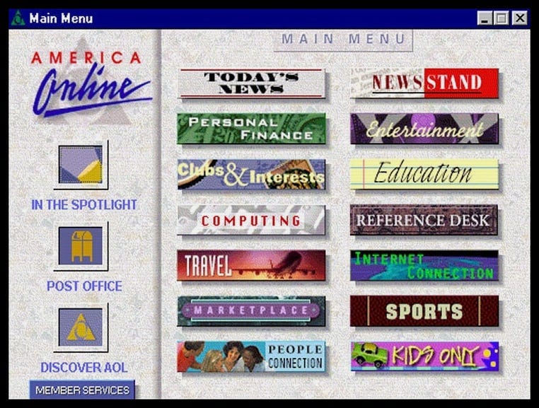
I’m just going to compose a bullet list of things to notice:
If I recall correctly—and I’m not sure that I do—the “Post Office” button simply took you to an inbox/compose email screen. Like the highway metaphor, a link to a virtual “post office” screen analogizes the sending and receipt of electronic messages with a familiar solid-life excursion. There’s no mistaking what an iconographic representation of a collection box receptacle denotes, and the familiarity of it must have been comforting to any number of grandparents whose grown children bought them a computer and insisted they give AOL a try.
I’m reluctant to say anything else about the vaporwave phenomenon or aesthetic, but please let me point out the marble “finish” of the backdrop. (The scanlines in zoomed-in image directly above don’t make it as clear as it is up top.) Whatever else marble connotes (stable and reliable institution?), it is something solid. Observe too how the sidebar on the left is made to appear as though it stands in elevated relief over the main section, and how the menu items are shown casting shadows. The imagery is designed not only to evoke concreteness, but three-dimensionality.
Digital minimalism wasn’t yet de riguer in 1995, so we see a lot of variegated color that sometimes clashes when the menu is viewed as a whole. I can’t help reading it as an expression of variety and of liveliness, reminiscent of going to a shopping mall (circa 1990-something of course) and taking in the sweep of a line of shops or food court eateries with incongruously styled logos.
The menu button graphics are baroque and austere by modern standards, but wonderfully textured. I feel a little silly saying so, but I get a whiff of synthetic pigskin and of dirty linen and cotton when I study the “Sports” and “Personal Finance” buttons. Observe that the “People Connection” button features a photograph of human beings instead of icons or cartoon figures, and the “Clubs & Interests” button uses a photographed bicycle wheel and postage stamp (both of which are more clear below).
Just as a side note: I love the “Internet Connection” button, which was AOL’s portal to a browser that took you out of the walled garden and into the world wide web. The image of the Earth from space conveys the massive scale and scope of the network, and being noticeably darker than the rest of the menu, the button is redolent of excitement, danger, and the unknown. (Pressing that button effectively put your subscription to AOL on a clock. Once you got a taste of virtual life off the reservation, everything else the service had to offer became superfluous.)
In retrospect, the America Online menu design seems to suggest that its services and its “space” are meant to be supplements to activity in solid-life, not replacements for it. It reminds us at every glance that there’s a whole world of things out there beyond the screen, and professes only to provide us with new avenues for enjoying them and getting more out of them than we already do. (Whether we believe it is beside the point.)
This is a screenshot from the Mac version of AOL 4.0, released in 1998. By that time, my household had cancelled its subscription and was using a different dial-up internet service. I don’t know if the Windows version looked any different, and apparently AOL nostalgia’s cutoff date is 1996. Google Images mostly returns photos of discs and old adverts when I search for any version released after 3.0.
The palette here is much more unified. The raw photographic imagery used in the menu items has been replaced by cartoonish icons or otherwise emerges from impressionistic hazes. The shading suggestive of raised buttons remains in use, but everything else suggestive of texture is gone. It’s all been flattened out and cleaned up.
I’m no expert in graphic design trends—but what this tells me is that even in 1998, there was already much less of a desire or perceived need to link these virtual artifacts to concrete referents. More people were coming online and getting acculturated to digital tech, and the public had grown more capable of understanding it on its own terms.3
What we’re witnessing is an increment in a precession from simulacrum to hyperreality—which has by now played out.
Examples:
Completely flat, except for the “raised” buttons on either side of the banner panel. Limited, cool palette. Completely solid. Minimalist menu icons. Clean—intimations of the Platonists’ disdain for the rank world of matter and their glorification of the abstract and the ideal.
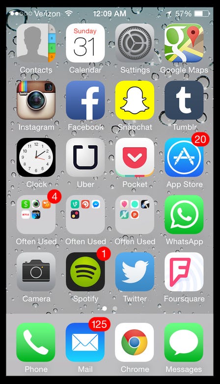
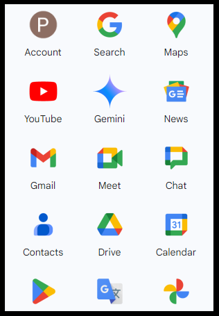
A somewhat garish specimen—but that’s on the user and his preferences. The modern pocket computer’s home screen owes much to the old AOL “channels” menu. Here we have an updated version of the old walled garden where, at the user’s choosing, individual business enterprises are given their own fenced-off plots. Most of the imagery you’ll see when your phone wakes up consists of corporate iconography that doesn’t necessarily indicate what services they provide, but is meant to impart the ineffable spirit or vibe of a given brand.
A bit off-topic, but here’s a study in contrasts: logging into AOL in 1995 and navigating to Facebook in 2020. The semblance of solidity suggested by the marble veneer of the AOL menu was reinforced by the fact that the screen was always the same. Whatever was happening on any of the message boards within the walled garden (to say nothing of those out on the web), whatever news stories had recently appeared under “Current Events,” whatever might have been added to or swapped out of any of the pages behind the buttons, AOL’s unchanging main menu gave no indication of it. Facebook’s algorithm-populated GUI emphasizes that things are always happening, always changing, and there are always new updates to check—which is of course why you and I and everyone else are online for over six hours a day.
No illusory three-dimensionality whatsoever; transparently and confidently flat. So self-referentially abstract as to be ideogrammatic. Google doesn’t need to explain itself. You know what services these icons and words represent because it’s fucking Google.
Don’t misunderstand: I’m not sitting here tearing my hair out with grief over the shameful state of GUI design and calling for a renaissance of a thirty-year-old aesthetic that was developed pretty much ad hoc to begin with. If anything, the visual language of cyberspace has gotten more honest as it’s grown unmoored from solid life.
A novel isn’t a transcription of an oral performance; film isn’t a stage play shot on camera; video games aren’t computerized versions table games or sports. Cyberspace isn’t actual space, and virtual artifacts aren’t imitations of objects. Abandoning the pretense of mere reformatting is the signal of any medium coming into maturity.
However, it is before this occurs that a new medium’s peculiarities can most clearly be viewed—though always only in retrospect, after we’ve been naturalized to the environment it creates. An examination of the initial assumptions that were changed or discarded in the course of its development is invaluable to understanding what it became and how it operates [on us].
By “titillation” I do mean sex. The role of porn in the growth of the web can’t be understated.
(I suppose I also mean the opportunity for what was then called “cybersex”—which, should any youths be reading, was basically sexting, sans pics, with strangers. I remember answering someone’s “wanna cyber” solicitation in a chat room when I was maybe 13, and even then I couldn’t take it seriously enough to stick around for more than a couple of minutes. In retrospect I strongly doubt there was really a 14-year-old girl on the other end.)
In early versions of Windows, the Minimize/Maximize/Close buttons at the top right corner of any window responded to a mouse click by seeming to depress like actual push-buttons. It was a neat way of communicating to the user the efficacy of what they were doing with their mouse, and it helped make the interface feel more natural and intuitive through a visual analogy with a concrete object. I don’t even remember when this bit of visual flair fell by the wayside. It was no longer necessary, at any rate.
I miss this.
Regarding the cybersex bit, I still cannot take seriously anyone who uses "cyber" by itself as a word (e.g. Cyber Monday) because it still calls to mind "putting on one's robe and wizard hat".